Post modernism is a philosophical term that is used in art, architecture, fashion, and design. It was found to follow the modern art period. It uses more of a purity of technique and art form that steers away from the pre-occupation of post war modernism. In post modern art, you can see the combined styles of art that were seen in classical and baroque.
Camp is essentially anything you want it to be. It’s a sense that over-the-top, ugly, abstract, unique, and misunderstood objects can be looked at as beautiful art. I have found that in culture nowadays the theme “camp” is everywhere. In the 20th century, it became more recognizable on the streets, in art, film, music and many other forms of expression. In this post, I will be analyzing 6 different pieces of art in which I interpret as “camp ” that were created by Joseph Havel, Samuel Bak, and Robert Rauschenberg.
Joseph Havel is a post modernism artist and sculptor that was born in Minneapolis, Minnesota. He is well educated with an MFA; Received at Pennsylvania State University and a BFA; received at University of Minnesota.
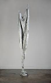
Between 1996-2006, Havel presented 30 sculptures that were shaped from cloth and cast in bronze. The second sculpture presented, Torn and Twisted Curtain is one of the pieces he created. It’s almost motionless as if it’s floating in a space with no gravity. It is simple yet shows that a lot of time and effort was put into it. The contrast from the shadows give the sculpture life and the texture makes the sheet look as if its soft and blowing in the wind. The balance between a realistic and fantasy effect is incredible. He made something simple into something extrordinary. I would interpret this piece as camp due to the unique use of a plain and boring sheet and sculpting it into something that no one would think of.
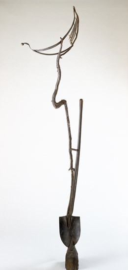
The first sculpture, Moon, June, Spoon, an odd yet satisfying sculpture. It shows a unique way of using everyday objects to create art. The contrast between the background and sculpture itself gives it a 3D effect. The way the shovel, and other forms of inanimate objects are used shows how anything can be used in order to create a masterpiece. There is very minimal color or texture that is utilized aside from the texture of the rusted shovel and old branch used to create the moon.

Robert Rauschenberg was a postmodern Artist that created digital color transfers from his own photography using inkjet dyes. In his famous Anagram series, his use of transferring the images using handheld burnishing is more apparent instead of using an electric press. The top two unique pieces were created by Robert Rauschenberg.
The Mirthday Man, shows a skeleton surrounded by many random themes. The colors are vibrant and the contrast between each object is apparent. The Skeleton is placed at the center of the frame gearing you to look directly at it. The use of colors are particular in objects that are needed to stand out. It gives off a fun and exciting vibe showing that the no plan is needed to create something amazing.
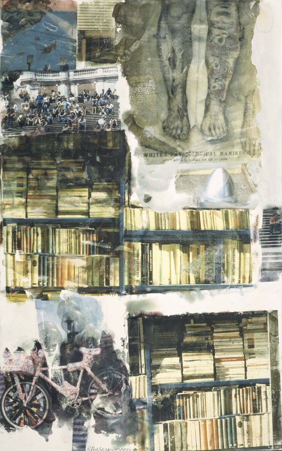
The Bookworms Harvest is my favorite piece between the two. It’s scholarly and intelligent with the use of a variety of books and diagrams. It’s almost comforting to look at this piece. There’s minimal amount of color used yet there is so much detail. He did an amazing job with the balance of books, people, and relative objects shown. There is so much contrast with the vague photos presented.

Samuel Bak is an American post modern painted and writer that survived the holocaust and moved to Israel in 1948 then spent the rest of his time in America since 1993. He’s a conceptual artist that implements different styles and “vernaculars”. He employed metaphor and allegory instead of painting direct scenes.
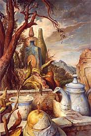
Both clearly show the style of painting that he uses. In Memorabilia II, the color balance is incredible with the detail in the up front focused objects. There is clear texture and shapes used in the fruit, tree, tea pot, and bottles. The theme of the painting seems to have came from an inspiration of a tea party that took place in a beautiful and rural location. The highlights of the particular moment is shown as your eyes are drawn to the meticulously pained pea, cup and tea pot.
Soutine Street is another painting that vaguely shows the famous tea cup that is presented in some of his well known art pieces. This painting is interesting with an abstract-like view of a street in a small village. It’s almost a cold and dark mood with broken up buildings and roofs. He uses a color balance of red, tan and dark colors to help create the mood that is frequently felt. There’s contrast between the buildings and background that makes the important elements more prominent.
MY THOUGHTS
All these art pieces apply to the camp theme due to their artistic creativity. Being able to implement objects and techniques that no one else has yet to utilize is a way to begin something incredible in the artistic community. It sets yourself apart from the rest and I believe that this is what these artists have done in post modern work. My favorite piece out of the six that I have presented would be Bookworms Harvest created by Robert Rauschenberg. He created pieces that are so unique that is mesmerizing. The use of random objects put into a single frame makes you think a second longer and spend more time unraveling it and finding the meaning to it compared to the rest. It’s odd yet interesting to where it makes it an incredible masterpiece.
Citations
“Anagram (1995–97).” Robert Rauschenberg Foundation, 21 Oct. 2014, https://www.rauschenbergfoundation.org/art/series/anagram#:~:targetText=Anagram (1995–97),transferred to paper using water.
“Campy Art and Why We Love It.” Widewalls, https://www.widewalls.ch/campy-art-definition-artworks-culture/.
Johnson, Patricia C. “Joseph Havel’s Cloth Work Twists, Turns and Stands on Its Own.” Houston Chronicle, Houston Chronicle, 24 July 2011, https://www.chron.com/entertainment/article/Joseph-Havel-s-cloth-work-twists-turns-and-1559099.php.
“Postmodernism.” The Artists, 4 Dec. 2018, https://www.the-artists.org/postmodernism/#:~:targetText=A few of the famous,Daniel Flahiff, and Hans Haacke.
“Samuel Bak.” Wikipedia, Wikimedia Foundation, 16 Sept. 2019,
